This blog was originally published on the Bearers of the Cross website.
No project should be without an eye catching logo and we wanted to make sure that the Bearers of the Cross project was no different. You will see our logo on the front page of the website, our promotional material and our twitter profile. But who is this mysterious head peaking out from under a cross-branded helmet and why did we chose it?
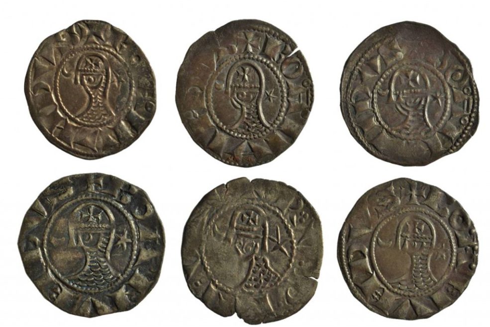
From the very start of the project we knew that we wanted the logo to be based on one of the objects in the Museum of the Order of St John’s collection. One area of the collection seemed perfect for adaptation into a logo: the Crusader coins. This is because the coins themselves would have acted as a very effective form of logo in the Latin East. So we started looking through the repertoire of medieval symbols and emblems used on the coins in the collection for inspiration. We were especially keen that the logo alluded to the themes of the project, so we priorities those which had explicit religious imagery. The most common crusader coin to be found today are those minted in vast quantities in Antioch during the reign of Bohemond III (1144-1201). They feature the bust of a knight wearing a helmet with nose-guard and a mail coat indicated by rows of crescent shapes. There are over 100 of these coins at the Museum of the Order of St John, and many more in the British Museum, London, Fitzwilliam Museum, Cambridge, and Ashmolean Museum, Oxford. What is distinctive about this bust is that the helmet is marked with a cross, this is a perfect visual rendition of the projects name Bearers of the Cross.
To transform this coin into a logo, we selected one of the better preserved examples and created a stylised illustration of the whole object. We then decided to abbreviate the image further, excluding the legend around the central knight to ensure that it was a simple and accessible as possible. The last decision to make was how to include the title of the project within the logo. Our first instinct was to continue with the coin theme and encircle the image with the project name – much like a legend on a coin. This created a clumsy image that was difficult to read and interpret at a quick glance so was discarded almost immediately!
We settled on what we have now, with the whole of the project title running to the right of the logo. We are quite fond of it – what do you think?